hNGxR5
Apa itu Custom Overlay?
Custom Overlay adalah fitur dimana kamu dapat melakukan kustomisasi terhadap Overlay kamu; jika sebelumnya kamu hanya bisa merubah warna dan jenis font, sekarang kamu dapat melakukan perubahan sebebas-bebasnya dengan menggunakan HTML dan CSS.
Cara akses Custom Overlay
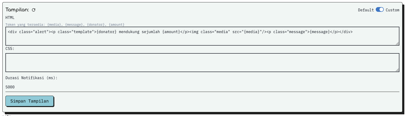 Buka halaman pengaturan overlay saweria dan klik custom pada ujung kanan atas dialog Tampilan seperti gambar diatas
Contoh Penggunaan
HTML:
<div class="alert">
<p class="template">{donator} mendukung sejumlah {amount}</p>
<img class="media" src="{media}" />
<p class="message">{message}</p>
</div>
CSS:
.template {
color: red;
}
.message {
color: blue;
}
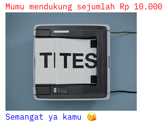
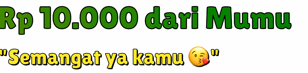
Jika digunakan, konfigurasi diatas akan ditampilkan oleh saweria sebagai seperti berikut
Jika kita lihat, terdapat beberapa token yang tersedia yaitu:
- message
- donator
- amount
- media
- wishlist
Pada saat menampilkan, saweria akan secara otomatis melakukan substitusi nilai terhadap token-token di atas.
Beberapa overlay oleh user saweria
@shaggy
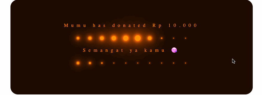
<section>
<h1 class="text alert">{donator} has donated {amount}</h1>
<div class="loader">
<div class="dot" style="--i:0;"></div>
<div class="dot" style="--i:1;"></div>
<div class="dot" style="--i:2;"></div>
<div class="dot" style="--i:3;"></div>
<div class="dot" style="--i:4;"></div>
<div class="dot" style="--i:5;"></div>
<div class="dot" style="--i:6;"></div>
<div class="dot" style="--i:7;"></div>
<div class="dot" style="--i:8;"></div>
<div class="dot" style="--i:9;"></div>
</div>
<h1 class="text message">{message}</h1>
<div class="loader">
<div class="dot" style="--i:0;"></div>
<div class="dot" style="--i:1;"></div>
<div class="dot" style="--i:2;"></div>
<div class="dot" style="--i:3;"></div>
<div class="dot" style="--i:4;"></div>
<div class="dot" style="--i:5;"></div>
<div class="dot" style="--i:6;"></div>
<div class="dot" style="--i:7;"></div>
<div class="dot" style="--i:8;"></div>
<div class="dot" style="--i:9;"></div>
</div>
</section>
* {
margin: 0;
padding: 0;
box-sizing: border-box;
}
section {
position: relative;
width: 100%;
height: 100vh;
display: flex;
justify-content: center;
align-items: center;
flex-direction: column;
background: #001300;
animation: changeColor 5s linear infinite;
border-radius: 25px;
}
@keyframes changeColor {
0% {
filter: hue-rotate(0deg);
}
100% {
filter: hue-rotate(360deg);
}
}
section h1 {
color: #00ff0a;
font-family: consolas;
font-weight: 500;
letter-spacing: 10px;
}
section .loader {
position: relative;
display: flex;
}
section .loader .dot {
position: relative;
display: block;
width: 20px;
height: 20px;
background: #00ff0a;
box-shadow: 0 0 10px #00ff0a, 0 0 20px #00ff0a, 0 0 40px #00ff0a, 0 0 60px
#00ff0a, 0 0 80px #00ff0a, 0 0 100px #00ff0a;
margin: 20px 10px;
transform: scale(0.1);
border-radius: 50%;
animation: animateDot 2s linear calc(0.1s * var(--i)) infinite;
}
section .loader:last-child .dot {
animation-delay: calc(-0.1s * var(--i));
}
@keyframes animateDot {
0% {
transform: scale(0.1);
}
10% {
transform: scale(1);
}
50%,
100% {
transform: scale(0.1);
}
}
@sandhikagalih

<div class="alert in">
<p class="template">
<span class="donatur">{donator}</span> mendukung Pa Dhika sejumlah
<span class="amount">{amount}</span>
</p>
<p class="message">{message}</p>
</div>
.alert {
position: relative;
background-color: #ff6e5c;
padding: 1em;
border-radius: 0.5em;
text-align: center;
font-size: 2em;
font-family: "IBM Plex Mono", monospace;
line-height: 1.5;
-webkit-font-smoothing: antialiased;
text-size-adjust: 100%;
text-rendering: optimizelegibility;
color: #333;
}
.message {
font-weight: bolder;
}
.donatur,
.amount {
color: white;
}
.alert:after {
content: "";
position: absolute;
top: 0;
left: 0;
right: 0;
bottom: 0;
border-radius: 10px;
background: linear-gradient(120deg, #3c4663, #c62000, #ff8b75);
background-size: 300% 300%;
clip-path: polygon(
0% 100%,
10px 100%,
10px 10px,
calc(100% - 10px) 10px,
calc(100% - 10px) calc(100% - 10px),
10px calc(100% - 10px),
10px 100%,
100% 100%,
100% 0%,
0% 0%
);
}
.alert.in:after {
animation: frame-enter 1s forwards ease-in-out reverse, gradient-animation 4s
ease-in-out infinite;
}
/* motion */
@keyframes gradient-animation {
0% {
background-position: 15% 0%;
}
50% {
background-position: 85% 100%;
}
100% {
background-position: 15% 0%;
}
}
@keyframes frame-enter {
0% {
clip-path: polygon(
0% 100%,
10px 100%,
10px 10px,
calc(100% - 10px) 10px,
calc(100% - 10px) calc(100% - 10px),
10px calc(100% - 10px),
10px 100%,
100% 100%,
100% 0%,
0% 0%
);
}
25% {
clip-path: polygon(
0% 100%,
10px 100%,
10px 10px,
calc(100% - 10px) 10px,
calc(100% - 10px) calc(100% - 10px),
calc(100% - 10px) calc(100% - 10px),
calc(100% - 10px) 100%,
100% 100%,
100% 0%,
0% 0%
);
}
50% {
clip-path: polygon(
0% 100%,
10px 100%,
10px 10px,
calc(100% - 10px) 10px,
calc(100% - 10px) 10px,
calc(100% - 10px) 10px,
calc(100% - 10px) 10px,
calc(100% - 10px) 10px,
100% 0%,
0% 0%
);
}
75% {
-webkit-clip-path: polygon(
0% 100%,
10px 100%,
10px 10px,
10px 10px,
10px 10px,
10px 10px,
10px 10px,
10px 10px,
10px 0%,
0% 0%
);
}
100% {
-webkit-clip-path: polygon(
0% 100%,
10px 100%,
10px 100%,
10px 100%,
10px 100%,
10px 100%,
10px 100%,
10px 100%,
10px 100%,
0% 100%
);
}
}
.alert {
animation: wiggle 0.1s ease-in-out alternate;
animation-iteration-count: 8;
}
@keyframes wiggle {
from {
transform: rotatez(4deg);
}
to {
transform: rotatez(-4deg);
}
}
@gngtrs
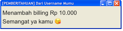
<div class="window" style="width: 415px">
<div class="title-bar">
<div class="title-bar-text">[PEMBERITAHUAN] Dari Username {donator}</div>
<div class="title-bar-controls">
<button aria-label="Minimize"></button>
<button aria-label="Maximize"></button>
<button aria-label="Close"></button>
</div>
</div>
<div class="window-body" style="font-size: 20px;">
<p>Menambah billing {amount}</p>
<p>{message}</p>
</div>
</div>
@import url("https://cdn.discordapp.com/attachments/827978220225691710/971379170384969728/XP.css");
@andhikanug
<div class="alert in">
<p class="template">
<span class="amount">{amount} dari {donator}</span>
</p>
<p class="message">{message}</p>
</div>
@import url("https://fonts.googleapis.com/css2?family=Lilita+One&display=swap");
.alert {
width: 2000px;
height: 720px;
font-family: "Lilita One", cursive;
}
.amount {
text-align: justify;
color: white;
-webkit-text-stroke-color: black;
-webkit-text-stroke-width: 3px;
font-size: 100px;
display: block;
color: transparent;
background-image: linear-gradient(
to right,
red,
orange,
green,
blue,
indigo,
purple
);
-webkit-background-clip: text;
animation: animate 0.5s linear infinite;
-webkit-background-size: 800%;
background-size: 800%;
}
.message {
text-align: justify;
color: rgb(255, 234, 42);
-webkit-text-stroke-width: 2px;
-webkit-text-stroke-color: black;
text-shadow: 3px 3px black;
font-size: 70px;
display: block;
margin-right: 40%;
}
@keyframes animate {
0% {
background-position: left;
}
50% {
background-position: center;
}
}
@aufalm

<div class="alert-wrapper">
<div class="alert-box slide-in">
<div class="alert-text">
<p class="donator">{donator} donated <span class="amount">{amount}</span>!</p>
<p class="wishlist">🎁 For wishlist: <span class="wishlist-item">{wishlist}</span></p>
<br>
<p class="message">{message}</p>
</div>
<div class="media-wrapper">
<img src="{media}" alt="media" class="media">
</div>
</div>
</div>
:root {
--primary: #00ffc3;
--secondary: #ff00ff;
--bg: rgba(20, 20, 40, 0.85);
--font: 'Orbitron', sans-serif;
}
body {
margin: 0;
padding: 0;
background: transparent;
font-family: var(--font);
}
.alert-wrapper {
position: absolute;
top: 10%;
left: 0;
width: 100%;
display: flex;
justify-content: center;
z-index: 9999;
}
.alert-box {
background: var(--bg);
border: 3px solid var(--primary);
border-radius: 16px;
box-shadow: 0 0 15px var(--primary), 0 0 30px var(--secondary);
padding: 1.5rem 2rem;
max-width: 600px;
width: 80%;
color: #fff;
display: flex;
align-items: center;
animation: fadeOut 8s ease forwards;
}
.alert-text {
flex: 1;
}
.donator {
font-size: 1.8rem;
font-weight: bold;
color: var(--primary);
text-shadow: 0 0 5px var(--primary);
}
.amount {
color: var(--secondary);
text-shadow: 0 0 5px var(--secondary);
}
.message {
font-size: 1.2rem;
margin-top: 0.5rem;
color: #ccc;
}
.media-wrapper {
margin-left: 1rem;
}
.media {
width: 80px;
height: 80px;
object-fit: cover;
border-radius: 10px;
border: 2px solid var(--secondary);
box-shadow: 0 0 10px var(--secondary);
}
.wishlist {
font-size: 1.1rem;
margin-top: 0.5rem;
color: var(--primary);
text-shadow: 0 0 3px var(--primary);
}
.wishlist-item {
display: inline-block;
background: var(--secondary);
color: #fff;
padding: 0.2rem 0.6rem;
border-radius: 8px;
margin-left: 0.3rem;
box-shadow: 0 0 5px var(--secondary), 0 0 10px var(--secondary);
font-weight: bold;
}
/* Slide In Animation */
.slide-in {
animation: slideInLeft 0.8s ease-out;
}
@keyframes slideInLeft {
from {
transform: translateX(-100%);
opacity: 0;
}
to {
transform: translateX(0);
opacity: 1;
}
}
/* Fade Out After Delay */
@keyframes fadeOut {
0%, 80% {
opacity: 1;
}
100% {
opacity: 0;
}
}
Saat ini custom overlay hanya terbuka untuk overlay Alert, namun akan dibuka juga untuk overlay yang lain di masa mendatang.